
Blueroomcare is a telehealth platform built to connect patients with doctors and mental health professionals remotely.
00

problem
When I came in, the product had three distinct layers of problems that each required a different design response. Cultural resistance: Mental health care isn't widely accepted in many African communities. Users approached the product with suspicion — or didn't approach it at all. Trust had to be designed in from the first screen. Inconsistent MVP: The existing product was visually fragmented — mismatched components, no coherent design language, and surfaces that felt unfinished. It didn't inspire confidence in users or stakeholders. Broken user flows: Onboarding and appointment booking were confusing to navigate. Users couldn't find their way through the core product without friction at every step. Not investor-ready: The product's presentation didn't match the ambition of the pitch. Investors needed to see a polished, coherent vision — not a rough MVP.
solution
Before touching the interface, I led user research focused on a specific question: what would make someone in an African context comfortable enough to seek mental health support through a digital platform? The research surfaced insights that fundamentally shaped every design decision that followed. Privacy was the entry point; Users weren't going to engage with a mental health platform unless they believed their information was completely private. Anonymity signals — subtle but deliberate — had to be built into onboarding from the first screen. Language and tone carried cultural weight Clinical language created distance. The product needed to feel warm and human — like a conversation, not a consultation. Copy, microcopy, and visual tone all had to work together to reduce the perceived stigma of seeking help. Trust in the provider mattered more than trust in the platform Users wanted to know who they were speaking to before they'd commit to a session. Doctor profiles, credentials, and visibility into the care model were critical to converting curious users into booked appointments. Mobile-first was non-negotiable The target users were predominantly mobile users. Every flow had to be designed with mobile as the primary surface — not adapted from desktop as an afterthought.
Armed with research, I approached the redesign as both a UX overhaul and a trust-building exercise. Every decision — from the color palette to the copy in the onboarding flow — was filtered through one question: does this make someone feel safe enough to take the next step?
01
Design system foundation
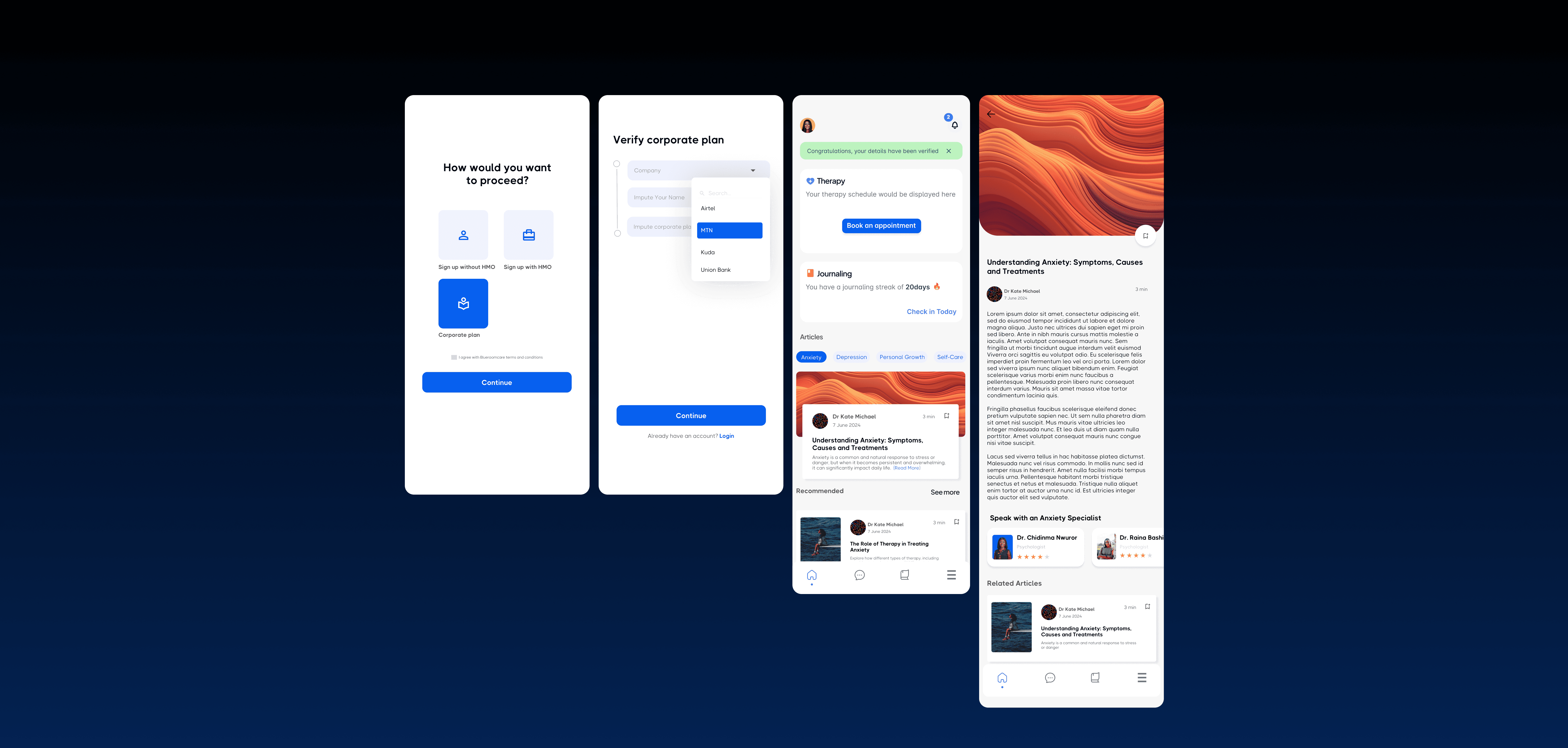
Built a coherent component library in Figma to replace the inconsistent MVP. Established a visual language that was warm and professional — approachable enough to reduce anxiety, credible enough to inspire trust in a healthcare context.
02
Onboarding redesign
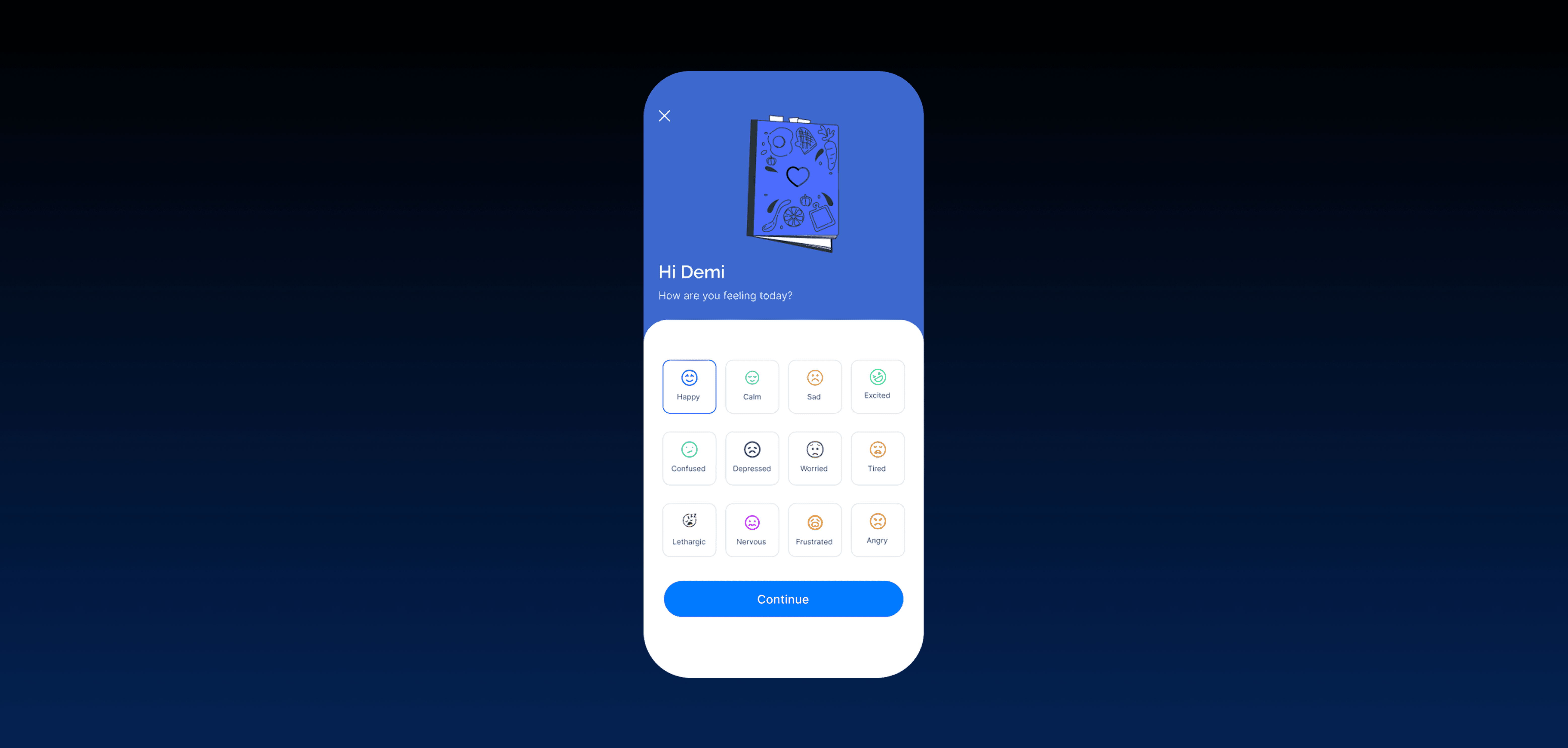
Rebuilt the patient onboarding flow from the ground up — progressive disclosure of information, privacy signals at every step, and tone-of-voice that felt human rather than clinical. Reduced the number of steps and removed friction points identified in user testing.
03
Appointment booking flow
Redesigned the booking experience to surface doctor profiles and credentials upfront — addressing the research insight that trust in the provider was the primary conversion driver. Simplified the selection and confirmation journey into a clear, linear flow.
04
Investor-facing materials
Designed pitch materials that presented the product vision clearly and professionally — translating the redesigned product into a compelling visual narrative for the funding conversation.
05
User testing and iteration
Validated designs with real users and ran stakeholder review cycles before finalising. The onboarding and booking flows went through multiple iterations based on testing feedback before sign-off.
year
2024-2026
timeframe
Ongoing
tools
Figma
category
Product design
01

02
03

04

see also

